Do you ever wonder what it takes to improve a photo from good to great? Most times it’s a simple tweak in posing, expression, lighting or outfit. Let’s look at a few images from a recent Self Portrait Session and determine what to look for as it relates to posing that will be the most flattering…
First set of comparisons
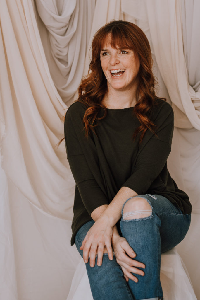
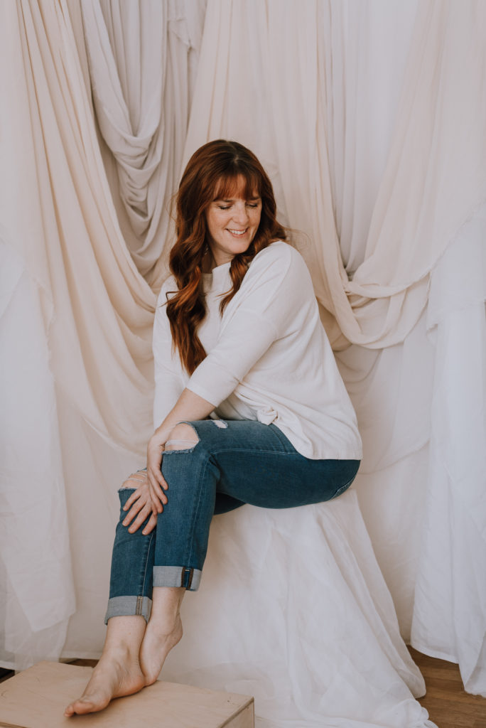
First, let’s talk about the image on the left. It shows a nice curvy shape on my toosh, it’s a closed pose where my arms stay within my body frame which draws the eyes inward narrowing the shape of my body. I fill the majority of the frame without too much open space above my head, or on either side. The general feeling of the image is joy with a natural “un posed” smile looking off camera. Looking off camera makes the image more natural and “unposed”.
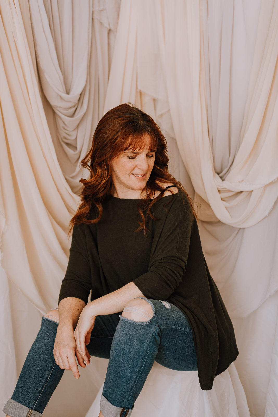
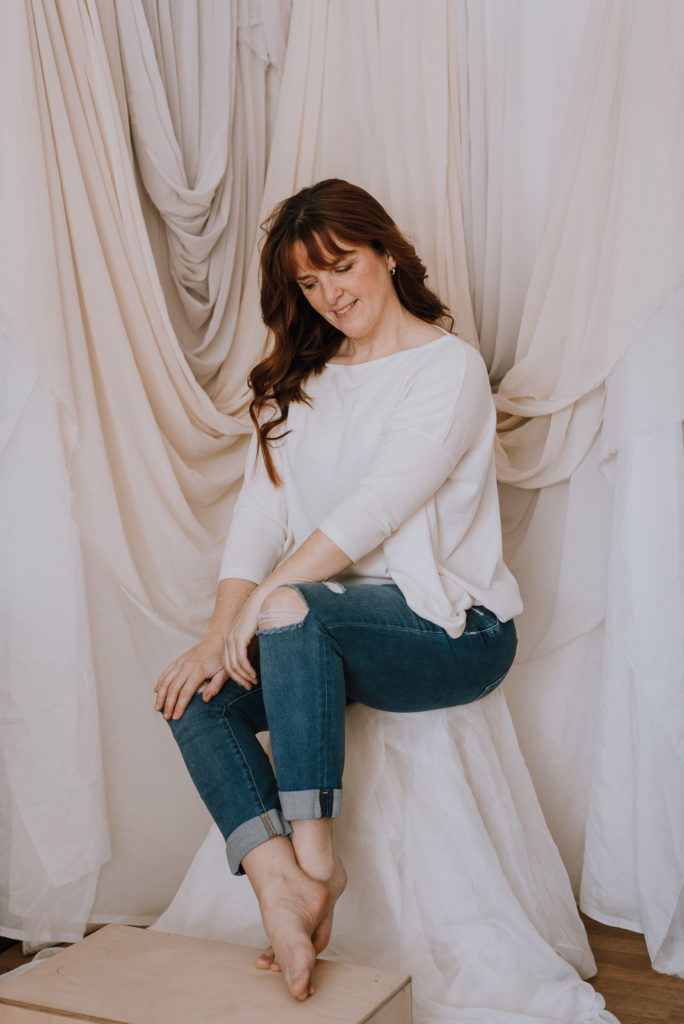
Now, the image on the right. The photo has an overall more whimsical feel with more of the draping fabric visible and the soft gaze down, gives a more thoughtful expression and calming feeling. The shape is lost, unfortunately, on my backside with the fabric not formed to my body. Careful thought was made to have my legs open with hands falling in for a more casual and thoughtful position. You don’t usually want to be straight on to the camera if you will have your knees apart. Not the most flattering or visually pleasing pose being straight on. It’s slight but you will also notice the knee closest to the camera in each image is raised slightly vs the other knee. That little adjustment adds some dimension to the body shape.
Second set of comparisons
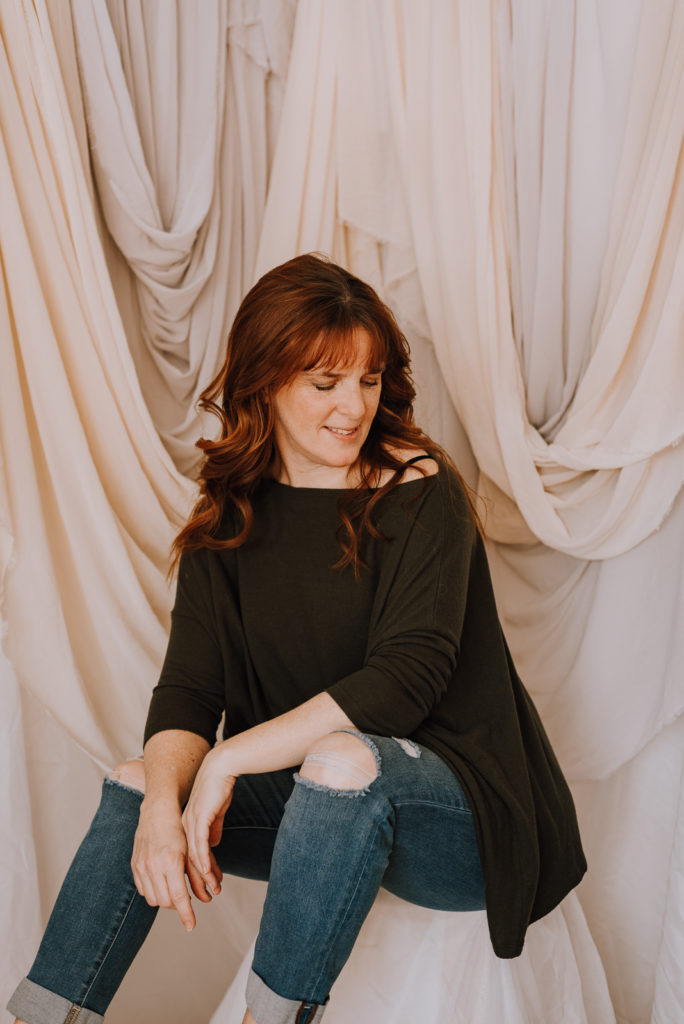
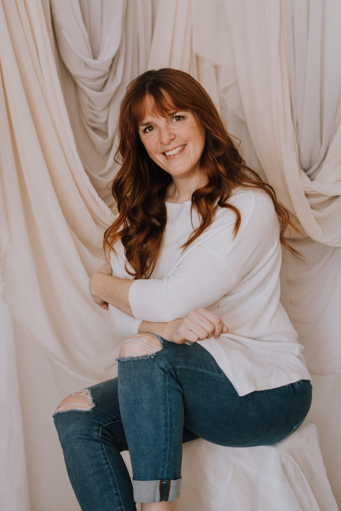
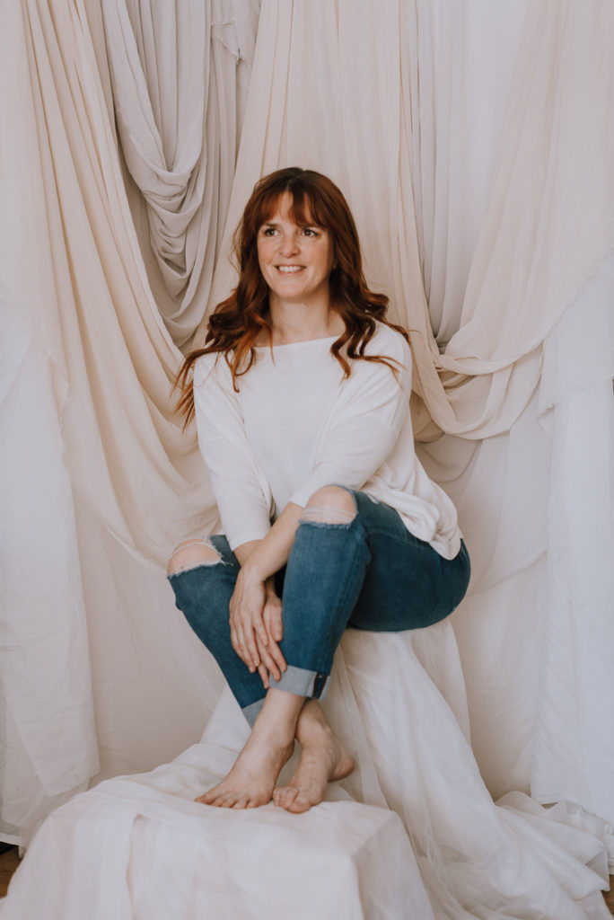
Let’s start again with the image on the left. First, the camera angle is slightly too low, making my butt look proportionally larger that it really is. Whatever is closest to the camera will be the largest. That’s the reason in both images I am at 45 degree to the camera so my legs don’t look proportionally too big or long. My hand closest to the camera might be a little more gentle if my fingers were loose and not in a fist. Overall, it’s an inviting image with good eye contact and a natural smile. It doesn’t look forced or awkward. The pose isn’t as delicate as the image on the right. Open legs and crossed arms give the image a bit more of an edge.
The image on the right, has a more delicate feel with soft open fingers, crossed feet and closed legs. Again, both images have the knee closest to the camera slightly raised for a more flattering shape and not squishing my thigh down making it look more full. The pulled back full body pose with looking away expression, also gives the photo a more intimate feel.
Third set of comparisons
Similar to the last set of comparison images, the biggest difference in these two is my posture. The image on the left is more delicate with strong feminine posture, where as on the right the pose is much more casual, laid back and slouchy. Toes pointed in the left image elongates my legs, where as flat feet on the right shortens my legs.
Moral of the story, for anyone looking to maximize their self portraits or posing in general, even if someone else is taking the image, is to keep a few things in mind. Posture, pointed toes and delicate hands/fingers and the curve of your back/backside. Wearing clothes that are too baggy and not at all form fitting, won’t do your figure the most flattering justice. Show off your curves!
More images to compare in my next post…hope this was helpful in demonstrating what to look for in your photos to help you try and get the most flattering angle, pose, expression and composition (close up vs pulled back and full body).
Until next time…if you want a quick reference guide to creating Scroll Stopping Self Portrait’s, sign up on my website for a FREE PDF download to get you started. Click HERE to sign up today!
Want to check out a few more blog posts on Self Portrait ideas, click HERE and HERE for more tips and ideas!
leave a comment