It’s that time of the year again. Patio season!
If you are like me, hanging out on the patio with my favourite drink in hand, is the BEST…when the temperature is just right.
Tangent…What is the best temperature for you to hang out, outside? For me it’s 18-24 degrees Celsius. Anything warmer than that and I am seeking shade or air conditioning. Anything cooler than that, I can still be outside if it’s sunny and I have my puffy vest on.
Back to why I sat to write this blog in the first place.
We recently got a new patio umbrella and I love it…but….
Well, let me tell you why I love it first.
1. It’s about 2’ bigger than our previous umbrella so it provides more coverage
2. It has a tilt function so in early evening we can tilt to avoid the setting sun
3. It has a crank to go up/down vs pushing with all your ever-loving strength to get it to latch in the “up” position or risk breaking a finger releasing the “up” latch to put it down
4. It’s teal and matches my fun outdoor furniture that are red and teal. That colour combo makes me very happy. It’s fun and playful and bright.
So, what don’t I love?
It’s teal. The same reason I love it, is the reason I don’t love it.
I was sitting on my deck with my laptop, working on personal stuff last weekend with the umbrella up and everything had a blue hue. I mean everything. My laptop, my BBQ, the table, my hands…and my FACE!
I went to grab a quick selfie (I did my hair that day, lol) and I was shocked at HOW BLUE my face was.

My first reaction was…we need to exchange this umbrella and my second reaction almost immediately was “this is a teachable moment”.
So, learn from my mistakes…and do not get a bright coloured patio umbrella if you plan on grabbing photos under it with your friends this summer or if you think the colour cast will be distracting.
We love the umbrella, so it will stay (in another area of the yard), and a black one is on its way. I found the blue hue way too distracting and almost sickly.
Colour casts in photos are almost hard to define unless you know what to look for.
Before I became more educated on “looking for light” I made the epic mistake of taking photographs in a red/orange brick alleyway and I was wearing a RED shirt. Epic fail x 2.
Now, don’t get me wrong, some colour casts can be corrected in post processing, but my rule is always get it right in camera when you can. Doing colour correction in post processing is so time consuming and you start to overthink the proper colour eventually.
So, here are a few suggestions to avoid getting colour casts on your photos. Selfies or pics with friends.
Colour casts and how to spot them
1. Red/orange brick building
2. Coloured brick pathways
3. Green trees overhead and all around close
4. A coloured company van with a bold logo.
5. Your own coloured shirt (neon, reds, greens, yellows). Earth tones you are pretty safe
6. Overhead patio umbrellas
Those are some of the most common colour casts that you may not see right away. You may actually only see them when you are looking back at photos and wondering why your skin looks like a Smurf. Trust me!
So…if you are planning on grabbing some photos outside. Selfies or with friends, look for a shaded area with nothing overhead (open shade). Step back from any immediate green foliage/trees and avoid bright colours for your top (if you can).
If you are looking for more tips to taking strong Professional Selfies here are a few links….
1. beginner-tips-to-taking-professional-selfies
2. reclaiming-confidence-the-benefits-of-taking-beautiful-self-portraits
3. 9-poses-for-self-portraits-to-show-variety-and-confidence


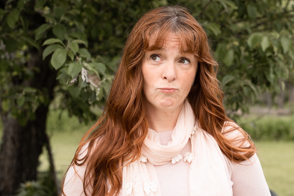

Remember to give yourself grace to grow, to learn, to fail, to comeback stronger.
Whatever yo do, do it with Gumption
Xo
leave a comment