The Business side of starting my Photography Journey.
Picking a logo was harder than I expected. I knew I wanted something fun but that’s really all I knew. I also knew what I didn’t want (whimsy and pastel), but it was much harder to nail down what I DID want.
My favourite colours are deep red and teal, so that was my starting point. I’m a huge dog lover so I was hoping that part of me would shine through .
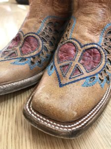
I also recently purchased a bad-ass pair of cowboy boots that fit my country girl style with hearts and wings. These were the limited details I sent to www.fiverr.com as a starting point.
And here is where we finished a few weeks later after many revisions. (Slight color tweaks, small changes with the camera strap, image inside the lens and camera shape and style).
The team at Fiverr were extremely patient with all my small requests and very prompt in sending back revisions. Made the whole experience so much easier.
Final decision on this one was it pigeon holed me into being a Western/Equestrian Photographer. So…not my main logo, but may have a place in my portfolio over time. So it stays on the shelf for the right time and place to use it.
I love the heart and wings in this one (although sometimes I see bat wings). For that, this one didn’t make my main logo, but stays on the shelf for another time.
This is the logo I landed on for my website. It wasn’t the fan favourite among fellow photographers that I admire and trusted to share their opinions, but it has the personality I was looking for. I was also very happy the heart and wings made it into the lens.
Not really sure why this one has a place on the shelf. Very similar to the one I chose as my #1, but the camera lens has a little spark that I couldn’t say no to.
This one I loved from the beginning, but unfortunately it was unanimous that I would be seen as a Pet Photographer. Definitely on the shelf and will no doubt have a place when I start building my pet portfolio. I could spend hours waiting to get the perfect shot of my pup while crawling in the grass on my belly. So yes, this one stays.
This was a Fan Favorite. Most “Professional” came up alot, and while I don’t disagree, I really like the way my name stretches the length of the webpage with the logo I chose. The best part is, I strategically used the camera image from this logo, in the one that runs lengthwise so I could use them both at the same time.
Dare I ask? Which one would you have chosen?
I like the one with the paw.